Top

Tag Archives | Data visualization

Data visualization tools become mainstream

We’ve come a long way from the hand drawn and photographed black and white graphs that were used to illustrate a key point in the days before computer graphics.

The techies among us were the first to play with color, line and movement to make data more intriguing, entertaining, and attractive, and data visualizations have progressed to the point of becoming reference resources rich in data about a given topic.

The Institute for Health Metrics and Evaluation has produced data visualizations on a range of topics. Particularly timely in the US, is this visualization showing personal health care spending by disease, type of care (ambulatory, inpatient, prescribed pharmaceutical, nursing facility, dental, and emergency), year, gender, and age group. We can see that in 2013 $18 billion was spent for pharmaceuticals for those under 20, compared to $112 billion spent for those 65 and over. In the group under 20, the greatest amounts were spent on mental and substance use disorders, followed by chronic respiratory diseases. In the group 65 and over, diabetes, treatment of risk factors, and cardiovascular diseases led the way.

Data visualizations keep coming

And publications are pouring out of these data visualization tools. A good example is the article by Roth et al, “Trends and patterns of geographic variation in cardiovascular mortality among US counties, 1980–2014” published in JAMA this past May. They estimate age-standardized mortality rates by county from cardiovascular diseases (CVD) for the United States.

Data visualizations help us understand causes of mortality.

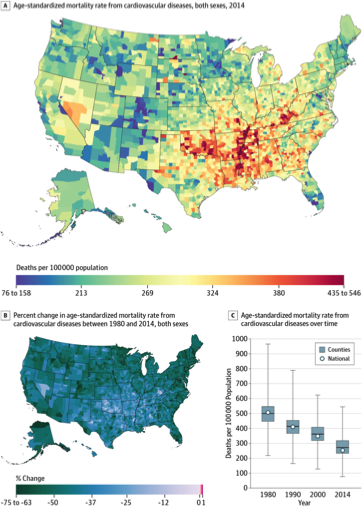
US County-Level Mortality From Cardiovascular Diseases A, Age-standardized mortality rate for both sexes combined in 2014. B, Percent change in the age-standardized mortality rate for both sexes combined between 1980 and 2014

Epidemiology and data visualization

We’ve always understood the value of data visualization

John Snow

If you’ve taken a look at any overview about epidemiology, or attended one lecture on the subject, you’ve heard of John Snow, the Victorian anesthesiologist, who tromped around London in his spare time, asking people about their water supply (water was delivered by different companies, and drawn from different pumps, accordingly). He associated one water supplier with a higher incidence of cholera deaths, inferring that something in the water was causing cholera – and this was before scientists had embraced the germ theory, and well before pathogens had been identified as causes of infectious disease.

Data visualization

John Snow’s map showing cases of cholera in 19th century London.

In addition to his excrutiating hand calculations of infections and death rates, he mapped the data. We can see references to his maps on all kinds of data visualization sites. Epidemiologists have always known about his maps; now they are garnering attention from non-epidemiologists.

Florence Nightingale

Another Victorian who didn’t mind using pencil and paper to add up lots and lots of numbers, was Florence Nightingale. Yes, the lady with the lamp, was also an ardent mathematician/statistician. She invented a type of diagram, “coxcombs” to visualize mortality by different causes.

Data visualization

Florence Nightingale called these diagrams, “coxcombs”.

But was she an epidemiologist? The term “epidemiologist” wasn’t in use when she was doing her work, but “she used statistics to measure health, identify causes of mortality, evaluate health services, and reform institutions.” (Stolley and Lasky, Investigating Disease Patterns, 1995).

Visualizing Health

From the Robert Wood Johnson Foundation and the University of Michigan Center for Health Communications Research

We’re starting to see the fruits of all the excitement about data visualization and health, notably this thorough report from Visualizing Health, a project of the Robert Wood Johnson Foundation and the University of Michigan Center for Health Communications Research.

As they state,

In theory, data can help us make better decisions about our health. Should I take this pill? Will it help me more than it hurts me? How can I reduce my risk? And so on.

But for individuals, it’s not always easy to understand what the numbers are telling us. And for those communicating the information – doctors, hospitals, researchers, public health professionals — it’s not always clear what sort of presentation will make the most sense to the most people.

Their web site contains examples of tested visualizations, and what’s especially nice, they’ve done research assessing reactions from the general public. They’ve created a gallery of graphs, charts, and images, and they’ve done the hard work of evaluating them.


from Visualizing Health, one of their data visualizations

one of their data visualizations

Among the goodies, a “wizard” tool to help you learn more about a risk you want to communicate, and a sample risk calculator that shows off some of the best design concepts.

I like the way they’ve identified use cases:

  • Tradeoffs between medication or treatment options?
  • Relating biomarkers (such as BMI or cholesterol levels) to risk?
  • Health risk assessment output?
  • Population risks: disparities?
  • Population risks: emergent disease (“Should I worry about that measles outbreak?”)
  • Understanding multiple side effects?Understanding unique side effects?
  • Motivating a risk-reducing action?
  • Understanding tradeoffs that change over time over time?
  • Small risks, and understanding how to reduce small risks?
  • Explaining what “average years saved” means for an individual person?

I like the way they describe their methodology, using three tools to test their images (google consumer surveys, survey sampling international, and amazon mechanical turk). Transparency is always appreciated!

And, at the back of the report (why at the back?) a comic book style presentation on visualizing health in practice, using images to educate patients about diabetes.

about health literacy

about health literacy

A Visual Medical Dictionary

With the Chi Visual Medical Dictionary, you can enter a disease or therapy and find all the terms it is related to, and retrieve a visualization of those relationships.  For example, this is the image retrieved using the term “epilepsy”.

Geographic Variation in Prescribing Practices

The authors used HEDIS quality measures, and mapped them by hospital referral region.

The map above shows variation in quality of prescribing high-risk drugs (medications considered to be high-risk for the elderly), and the map below shows variation in prescribing drugs with potentially harmful drug-disease interactions.

NEJM November 2010