
From the Robert Wood Johnson Foundation and the University of Michigan Center for Health Communications Research
We’re starting to see the fruits of all the excitement about data visualization and health, notably this thorough report from Visualizing Health, a project of the Robert Wood Johnson Foundation and the University of Michigan Center for Health Communications Research.
As they state,
In theory, data can help us make better decisions about our health. Should I take this pill? Will it help me more than it hurts me? How can I reduce my risk? And so on.
But for individuals, it’s not always easy to understand what the numbers are telling us. And for those communicating the information – doctors, hospitals, researchers, public health professionals — it’s not always clear what sort of presentation will make the most sense to the most people.
Their web site contains examples of tested visualizations, and what’s especially nice, they’ve done research assessing reactions from the general public. They’ve created a gallery of graphs, charts, and images, and they’ve done the hard work of evaluating them.
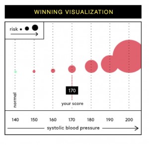
one of their data visualizations
Among the goodies, a “wizard” tool to help you learn more about a risk you want to communicate, and a sample risk calculator that shows off some of the best design concepts.
I like the way they’ve identified use cases:
- Tradeoffs between medication or treatment options?
- Relating biomarkers (such as BMI or cholesterol levels) to risk?
- Health risk assessment output?
- Population risks: disparities?
- Population risks: emergent disease (“Should I worry about that measles outbreak?”)
- Understanding multiple side effects?Understanding unique side effects?
- Motivating a risk-reducing action?
- Understanding tradeoffs that change over time over time?
- Small risks, and understanding how to reduce small risks?
- Explaining what “average years saved” means for an individual person?
I like the way they describe their methodology, using three tools to test their images (google consumer surveys, survey sampling international, and amazon mechanical turk). Transparency is always appreciated!
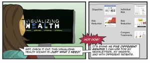
And, at the back of the report (why at the back?) a comic book style presentation on visualizing health in practice, using images to educate patients about diabetes.
about health literacy
Comments are closed.