We’ve come a long way from the hand drawn and photographed black and white graphs that were used to illustrate a key point in the days before computer graphics.
The techies among us were the first to play with color, line and movement to make data more intriguing, entertaining, and attractive, and data visualizations have progressed to the point of becoming reference resources rich in data about a given topic.
The Institute for Health Metrics and Evaluation has produced data visualizations on a range of topics. Particularly timely in the US, is this visualization showing personal health care spending by disease, type of care (ambulatory, inpatient, prescribed pharmaceutical, nursing facility, dental, and emergency), year, gender, and age group. We can see that in 2013 $18 billion was spent for pharmaceuticals for those under 20, compared to $112 billion spent for those 65 and over. In the group under 20, the greatest amounts were spent on mental and substance use disorders, followed by chronic respiratory diseases. In the group 65 and over, diabetes, treatment of risk factors, and cardiovascular diseases led the way.
Data visualizations keep coming
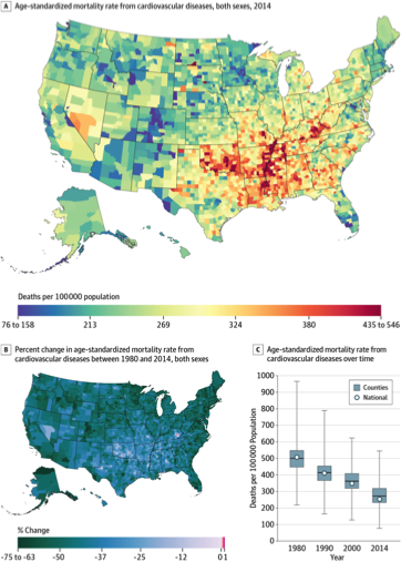
And publications are pouring out of these data visualization tools. A good example is the article by Roth et al, “Trends and patterns of geographic variation in cardiovascular mortality among US counties, 1980–2014” published in JAMA this past May. They estimate age-standardized mortality rates by county from cardiovascular diseases (CVD) for the United States.

US County-Level Mortality From Cardiovascular Diseases A, Age-standardized mortality rate for both sexes combined in 2014. B, Percent change in the age-standardized mortality rate for both sexes combined between 1980 and 2014

