We’ve always understood the value of data visualization
John Snow
If you’ve taken a look at any overview about epidemiology, or attended one lecture on the subject, you’ve heard of John Snow, the Victorian anesthesiologist, who tromped around London in his spare time, asking people about their water supply (water was delivered by different companies, and drawn from different pumps, accordingly). He associated one water supplier with a higher incidence of cholera deaths, inferring that something in the water was causing cholera – and this was before scientists had embraced the germ theory, and well before pathogens had been identified as causes of infectious disease.
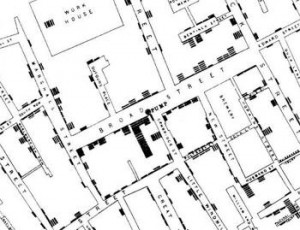
John Snow’s map showing cases of cholera in 19th century London.
In addition to his excrutiating hand calculations of infections and death rates, he mapped the data. We can see references to his maps on all kinds of data visualization sites. Epidemiologists have always known about his maps; now they are garnering attention from non-epidemiologists.
Florence Nightingale
Another Victorian who didn’t mind using pencil and paper to add up lots and lots of numbers, was Florence Nightingale. Yes, the lady with the lamp, was also an ardent mathematician/statistician. She invented a type of diagram, “coxcombs” to visualize mortality by different causes.

Florence Nightingale called these diagrams, “coxcombs”.
But was she an epidemiologist? The term “epidemiologist” wasn’t in use when she was doing her work, but “she used statistics to measure health, identify causes of mortality, evaluate health services, and reform institutions.” (Stolley and Lasky, Investigating Disease Patterns, 1995).